I had the pleasure last year to meet with Gil Tene, an authority on building high performance software and specifically high performance JVM implementations. He gave a brilliant presentation at React San Francisco and then again at YOW in Australia on common mistakes made when measuring performance. He he explained that measuring latency is not about getting a number, but identifying behavior and characteristics of a system.
Often when we set out to measure the performance of our software we can be guided by NFR (Non-Functional Requirements) that really don't make too much sense. More than once I have been presented with a requirement that the system must process x requests per time-period e.g 5 messages per second. However as Gil points out this single number is either unreasonable, or misleading. If the system must always operate in a state to support these targets then it may be cost prohibitive. This requirement must also define 100% up-time. To work around that, some requirements specify that the mean response time should be y. However this is potentially less useful. By definition what we are really specifying is the 50% of requests must see worse performance than the target.
A useful visualization for pointing out the folly of chasing a mean measurement is illustrated below.
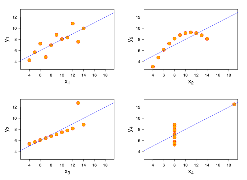
[Source - https://en.wikipedia.org/wiki/Anscombe%27s_quartet]
All of these charts have the same mean value, but clearly show different shapes of data. If you measuring latency in your application and were targeting a mean value, you may be able to hit these targets but still have unhappy customers.
When discussing single value targets, a mean value can be thought of as just the 50th percentile. In the first case the requirement was for the 100th percentile.
Perhaps what is more useful is to measure and target several values. Maybe the 99th percentile plus targets at 99.9% and 99.99% etc is what you really are looking for.
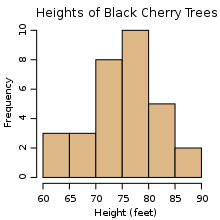
The example of a histogram from Wikipedia shows how to represent heights by grouping into buckets of 5cm ranges. For each value of the 31 Black Cheery Trees measured, the height is assigned to the bucket and the count for that bucket increased. Note that the x axis is linear.
A naive implementation of a histogram however, may require you to pre-plan your number and width of your buckets. Gil Tene has helped out here by creating an implementation of a histogram that specifically is design for high dynamic ranges, hence its name HdrHistogram.
When you create an instance of an HdrHistogram you simply specify
Instead we thought it better to provide a static visualization of what was happening in our system when it was overloaded with data from the server. We could then contrast that with alternative implementations showing how we can perform load-shedding on the client. This also meant we could present with a single high powered laptop, instead of bringing the toy i3 along with us just to demo.
We added a port of the original Java HdrHistogram to our .NET code base. We used it to capture the latency of prices from the server, to the client, and then the additional latency for the client to actually dispatch the rendering of the price. As GUI applications are single threaded, if you provided more updates than the GUI can render, there are two things that can happen:

We had two problems. The first problem was an assumption that what worked for Silverlight, would also work for WPF. As WPF has two threads dedicated to presentation (a UI thread and a dedicated Render thread), we were actually only measuring how long it took for us to put a price on another queue! You can see that the ObserveLatest1 and ObserverLatest2 (red and yellow) lines show worse performance than just processing all items on the dispatcher. I believe this is due to us just doing more work to conflate before sending to the render thread. Unlike in Silverlight, once we send something to the Render thread in WPF we can no longer measure the time taking to actually render the change. So our measurements here were not really telling us the full story.
The second problem we see is that there was actually a bug in the code we copied from our original silverlight (Rx v1) code. The original code (red line) accidentally used a MultipleAssignmentDisposable instead of a SerialDisposable. The simple change gave us the improvements seen in the yellow line.
We were happy to see that the Conflate and ConstantRate algorithms were measuring great results, which were clearly supported visually when using the application.
To find out more about the brilliant Gil Tene
Often when we set out to measure the performance of our software we can be guided by NFR (Non-Functional Requirements) that really don't make too much sense. More than once I have been presented with a requirement that the system must process x requests per time-period e.g 5 messages per second. However as Gil points out this single number is either unreasonable, or misleading. If the system must always operate in a state to support these targets then it may be cost prohibitive. This requirement must also define 100% up-time. To work around that, some requirements specify that the mean response time should be y. However this is potentially less useful. By definition what we are really specifying is the 50% of requests must see worse performance than the target.
A useful visualization for pointing out the folly of chasing a mean measurement is illustrated below.
[Source - https://en.wikipedia.org/wiki/Anscombe%27s_quartet]
All of these charts have the same mean value, but clearly show different shapes of data. If you measuring latency in your application and were targeting a mean value, you may be able to hit these targets but still have unhappy customers.
When discussing single value targets, a mean value can be thought of as just the 50th percentile. In the first case the requirement was for the 100th percentile.
Perhaps what is more useful is to measure and target several values. Maybe the 99th percentile plus targets at 99.9% and 99.99% etc is what you really are looking for.
Measuring latency with histograms
Instead of capturing a count and a sum of all latency recorded to then calculate a mean latency, you can capture latency values and assign them to a bucket. The assignment of this value to a bucket is to simply increment the count of that bucket. This now allows us to analyse the spread of latency recordings.The example of a histogram from Wikipedia shows how to represent heights by grouping into buckets of 5cm ranges. For each value of the 31 Black Cheery Trees measured, the height is assigned to the bucket and the count for that bucket increased. Note that the x axis is linear.
A naive implementation of a histogram however, may require you to pre-plan your number and width of your buckets. Gil Tene has helped out here by creating an implementation of a histogram that specifically is design for high dynamic ranges, hence its name HdrHistogram.
When you create an instance of an HdrHistogram you simply specify
- a maximum value that you will support
- the precision you want to capture as the number of significant digits
- optionally, the minimum value you will support
The internal data structures of the HdrHistogram are such that you can very cheaply specify a maximum value that is an order of magnitude larger than you will expect, thus giving you enough headroom for your recorded values. As the HdrHistogram is designed to measure latency a common usage would be to measure a range from the minimum supported value for the platform (nanoseconds on JVM+Linux, or ticks on .NET+Windows) up to an hour, with a fidelity of 3 significant figures.
For example, a Histogram could be configured to track the counts of observed integer values between 0 and 36,000,000,000 while maintaining a value precision of 3 significant digits across that range. Value quantization within the range will thus be no larger than 1/1,000th (or 0.1%) of any value. This example Histogram could be used to track and analyze the counts of observed response times ranging between 1 tick (100 nanoseconds) and 1 hour in magnitude, while maintaining a value resolution of 100 nanosecond up to 100 microseconds, a resolution of 1 millisecond(or better) up to one second, and a resolution of 1 second (or better) up to 1,000 seconds. At it's maximum tracked value(1 hour), it would still maintain a resolution of 3.6 seconds (or better).
Application of the HdrHistogram
When Matt (@mattbarrett) and I presented Reactive User Interfaces, we used the elements of drama and crowd reaction to illustrate the differences between various ways of conflating fast moving data from a server into a client GUI application. To best illustrate the problems of flooding a client with too much data in a server-push system, we used a modestly powered Intel i3 laptop. This worked fairly well in showing the client application coming to its knees when overloaded. However it also occasionally showed Windows coming to its knees too, which was a wee bit too much drama to have on stage during a live presentation.Instead we thought it better to provide a static visualization of what was happening in our system when it was overloaded with data from the server. We could then contrast that with alternative implementations showing how we can perform load-shedding on the client. This also meant we could present with a single high powered laptop, instead of bringing the toy i3 along with us just to demo.
We added a port of the original Java HdrHistogram to our .NET code base. We used it to capture the latency of prices from the server, to the client, and then the additional latency for the client to actually dispatch the rendering of the price. As GUI applications are single threaded, if you provided more updates than the GUI can render, there are two things that can happen:
- updates are queued
- updates are conflated
What you do in your client application depends on your requirements. Some systems will need to process every message. In this case they may choose to just allow the updates to be queued. Other systems may allow updates to be conflated. Conflation is the act of taking many and reducing to one. So for some systems, they maybe able to conflate many updates and average them or aggregate them. For other systems, it may only be the last message that is the most important, so the conflation algorithm here would be to only process the last message. Matt discusses this in more detail on the Adaptive Blog.
In the demo for ReactiveTrader we demo queuing all updates and 3 styles of conflation. When we applied the HdrHistogram to our code base, we were quick to see we actually had a bug in our code base.

We had two problems. The first problem was an assumption that what worked for Silverlight, would also work for WPF. As WPF has two threads dedicated to presentation (a UI thread and a dedicated Render thread), we were actually only measuring how long it took for us to put a price on another queue! You can see that the ObserveLatest1 and ObserverLatest2 (red and yellow) lines show worse performance than just processing all items on the dispatcher. I believe this is due to us just doing more work to conflate before sending to the render thread. Unlike in Silverlight, once we send something to the Render thread in WPF we can no longer measure the time taking to actually render the change. So our measurements here were not really telling us the full story.
The second problem we see is that there was actually a bug in the code we copied from our original silverlight (Rx v1) code. The original code (red line) accidentally used a MultipleAssignmentDisposable instead of a SerialDisposable. The simple change gave us the improvements seen in the yellow line.
We were happy to see that the Conflate and ConstantRate algorithms were measuring great results, which were clearly supported visually when using the application.
To find out more about the brilliant Gil Tene
- see his talk at React San Francisco and then again at YOW in Australia
- check out his web site - http://latencytipoftheday.blogspot.co.uk
- follow him on twitter @giltene
- see his content on infoQ - http://www.infoq.com/author/Gil-Tene
- or look at Azul (https://www.azul.com/) and the things they can make Java code do
I am currently working on the final details of a complete port of the original Java HdrHsitogram to .NET. You can see my work here - https://github.com/LeeCampbell/HdrHistogram.NET

